Participant Feedback and Recommendations
Participants provided ongoing feedback as they completed each task, as well as any task completion questions that arose. Their comments, along with the task completion and errors data, form the basis for our recommendations.
Do you prefer the initial view of the map collapsed or expanded?
Collapsed – 28.57%
Expanded – 71.43%
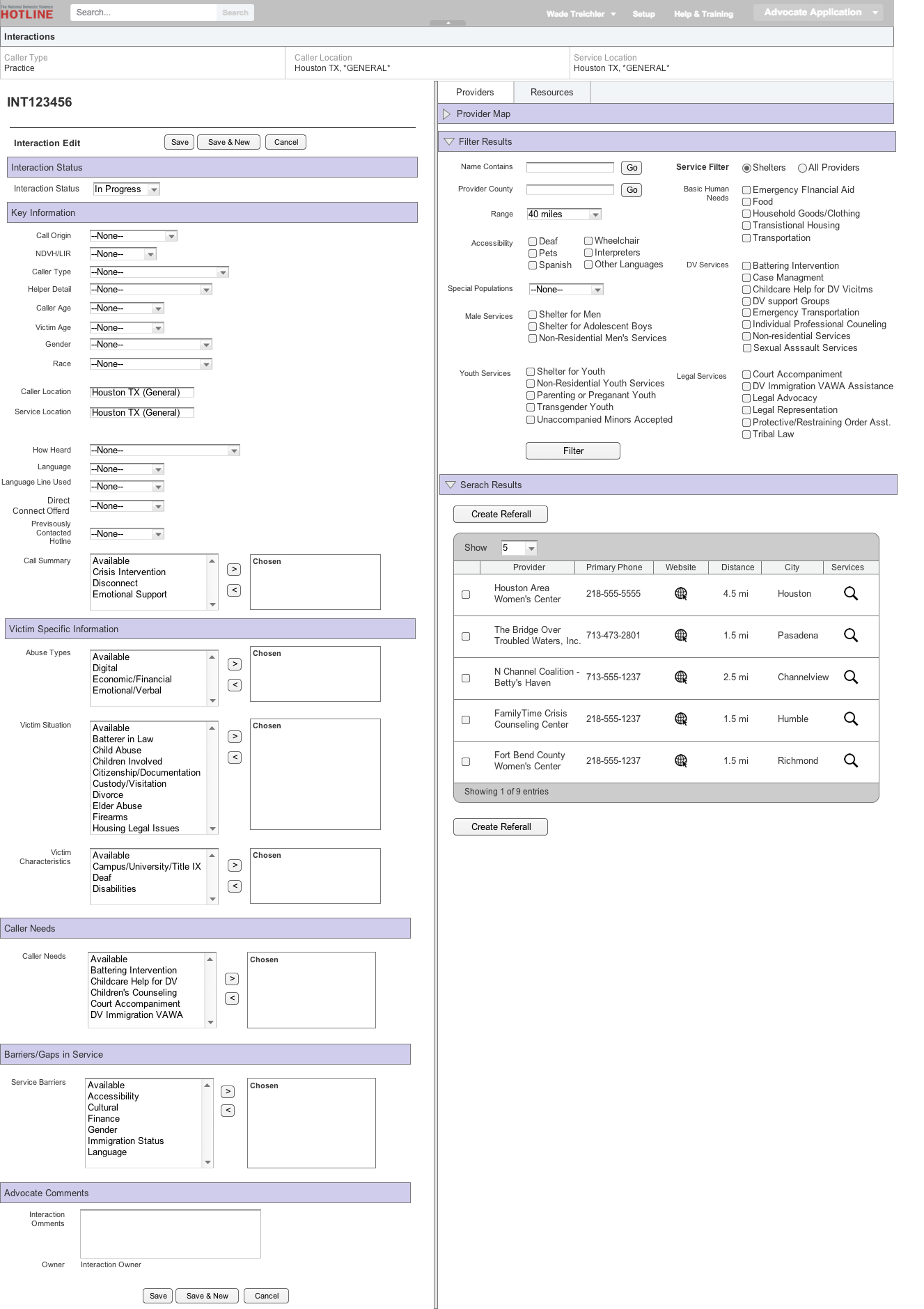
Open-entry feedback: Feedback supported keeping the map expanded, perhaps without the option of collapsing. One advocate expressed that she feels “more connected with the caller” when she has the location readily available, and provided very positive feedback about the map experience overall.
As compared to the current system, do you find the new filtering options to be:
Much more useful – 100%
Somewhat more useful – 0%
Neutral – 0%
Less useful – 0%
Much less useful – 0%
Open-entry feedback: One participant expressed that titles / headers could be larger, or formatted in a way so that they’re easier to read. Another said, “Wow, that’s great” and added that the additional filtering options helped her visualize what could be offered to the caller. Other participants had positive overall reactions in terms of ease-of-use and improved filtering options.
As compared to the current system, do you find the new service provider layout to be:
Much more useful – 42.86%
Somewhat more useful – 42.86%
Neutral – 14.29%
Less useful – 0%
Much less useful – 0%
Open-entry feedback: Overall feedback was positive. However, one participant said she felt it was the same usefulness as current layout.
In terms of ease-of-use, do you find the provider services layout to be:
Much easier to use – 57.14%
Somewhat easier to use – 42.86%
Neutral – 0%
Less easy to use – 0%
Much less easy to use – 0%
Open-entry feedback: Feedback was very positive. One participant remarked, “This is going to be a lot more user friendly.” Another said, “You guys are doing a good job in making this [less] challenging. It’s cool, it really is awesome.”


